Skyltmax
Checkout Page Optimisation

CLIENT
Skyltmax
YEAR
2020
ROLE
UX designer
AGENCY
Employment
Team
Project background
How Skyltmax fine-tuned the checkout experience
The project aimed to optimise the checkout page of Skyltmax’s website, focusing on delivering a seamless and efficient transaction experience for customers. Through in-depth analysis and user feedback, the company continuously identified pain points and areas for improvement.
By simplifying the design, providing clear instructions, and implementing trust indicators, Skyltmax enhanced the checkout page’s usability and instilled customer confidence in finalising their purchases. One focus area was also put on streamlining the process by auto-populating information and generally optimising the filling out of form fields.
Mobile responsiveness was prioritised, accommodating the growing number of customers using mobile devices for purchases. Extensive AB-testing and iteration ensured the effectiveness of the optimisations.
As a result, the checkout page significantly improved conversion rates and customer satisfaction. Customers found it easier and more efficient to complete transactions, reducing cart abandonment and increasing successful purchases.
This project reflects Skyltmax’s dedication to delivering a seamless and user-centric shopping experience by removing barriers and friction points in the checkout process.
TL;DR Skyltmax continuously improved the checkout page experience by focusing on areas such as mobile users, auto-populating information, easier flow to fill out the form fields, to give information needed to give the customer confidence enough to fullfil the purchases and more. In the end, a high-performing checkout page with an emphasis on mobile improvements resulting in a conversion rate increase of +18.85%.

A more frictionless experience for mobile users
Mobile users comes first
Focus on mobile users checkout experience
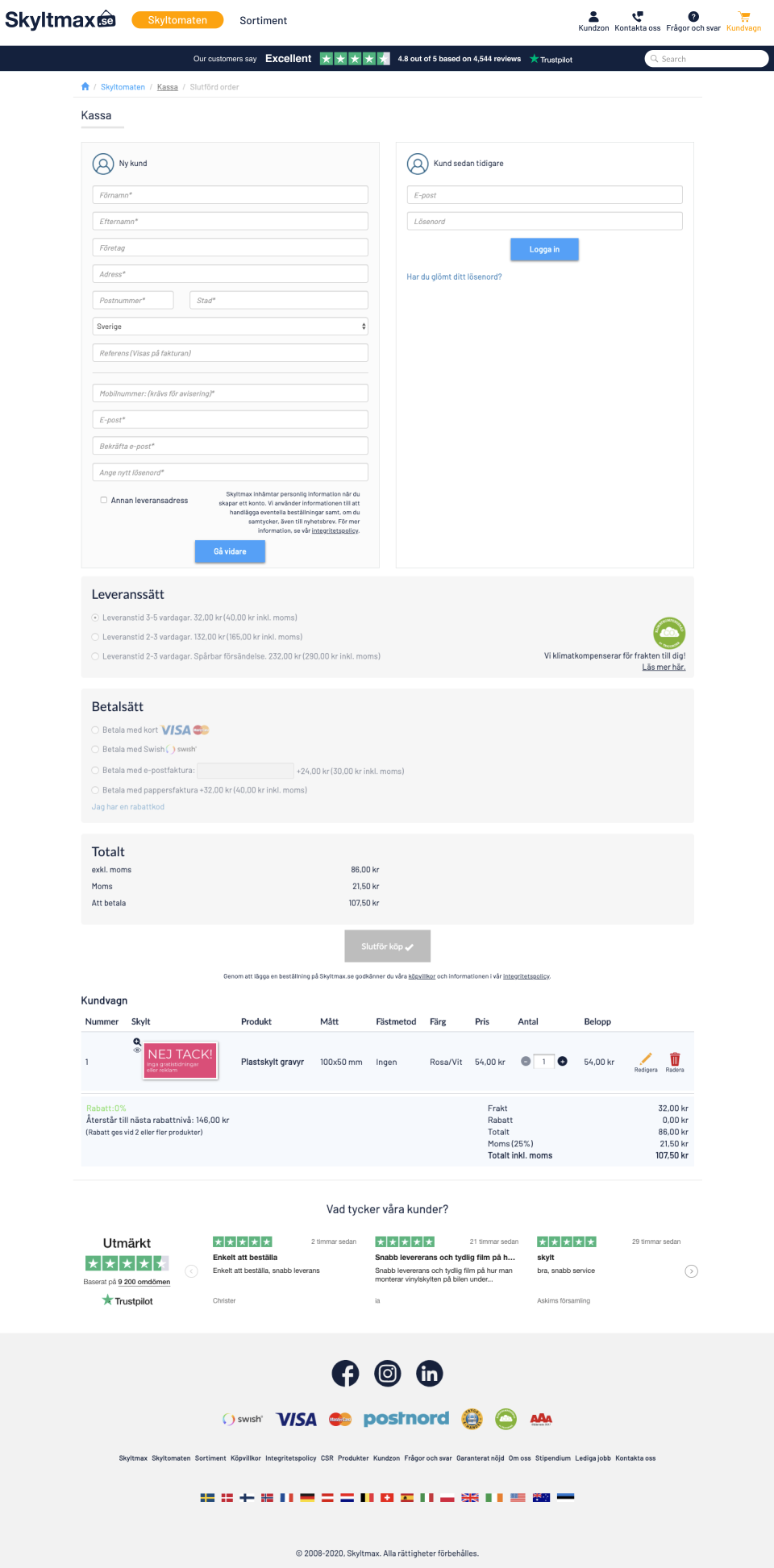
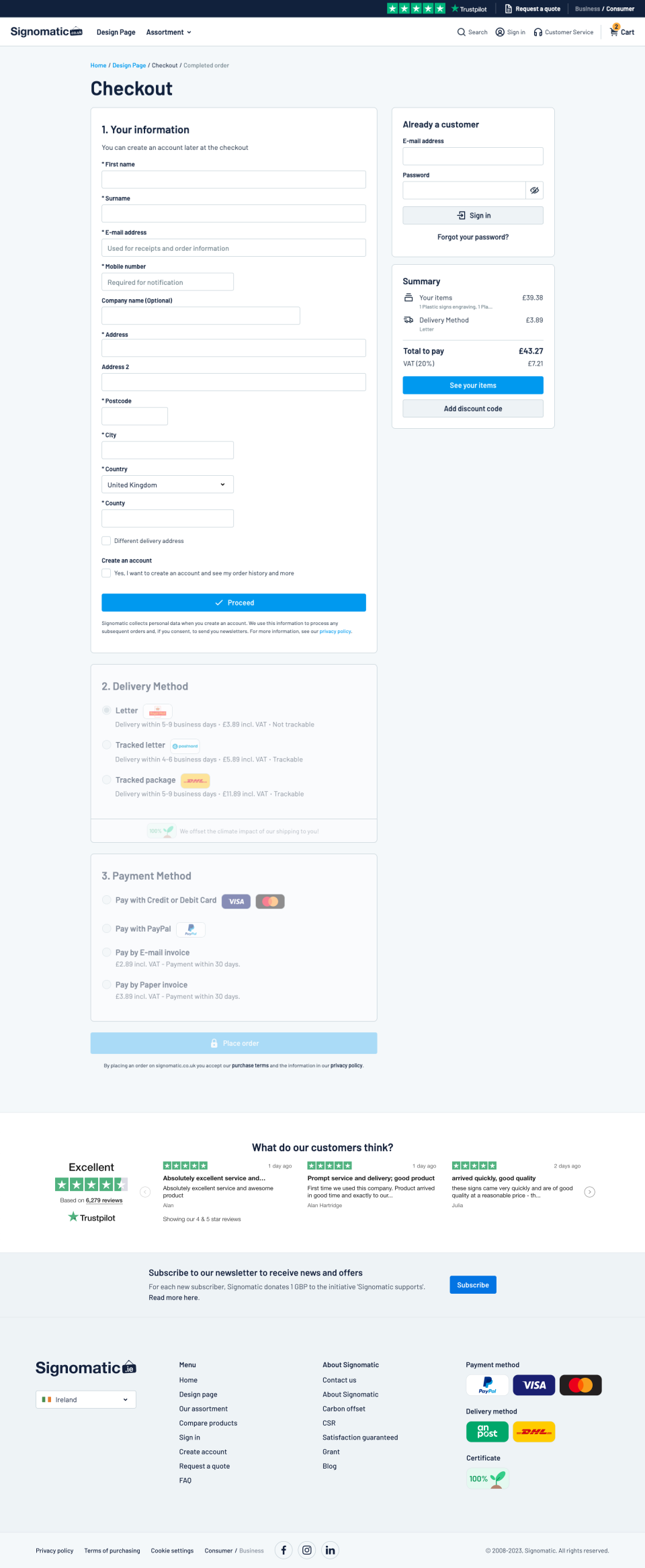
Over the years Skyltmax has seen a big difference in conversion rates between desktop and mobile users. Because of this reality focus was put on mobile users in particular. To make the checkout experience more pleasant and in the end increase and lessen the gap between devices. Below you see some example screens from the current checkout page (Aug, 2023).


Dare to be wrong
Sometimes your hypothesis needs to be disproved for the experience to be improved
Improvements don’t always follow a straight line. Skyltmax experienced this first hand. Not all the tests or hypothesis over the years has been accurate. This is a natural part of the optimisation process and learning about your users. One great example of this was implementing an address search field. Meaning that instead of manually filling out all address fields for user’s without auto-complete they’d only had to search for their street name and see the postcode, city and county be added automatically.
This feature was released, even though during testing it proved that the service was not always 100% reliable. Altough, after rigid testing we expected it to be good enough to help thousands of customers. Unfortunately, we were wrong. The release resulted in horrible conversion rate numbers. It seemed that for those it worked for it helped, but there were too many users having issues to get the address search to work. So instead of removing obstacles we accidentally added some. This caused the users to have to re-check the address, fill out any missing field anyways and overall it was not a successful feature.
After rolling back the test the company again saw the conversion rate rise. Some takeaways from this is that it’s fine to test your hypothesis, because if your wrong: Great! You’ve learned what doesn’t work. Another lesson is that you can’t always think fewer input fields or the more traditional “Fewer clicks is better”. It is not always the case. Sometimes a few more fields without the once in while occurring issues is better than a better solution for some.

Hypothesise, design, test, repeat
Each incremental improvment is subtle. The long-term results is not.
After a couple of years of continuous improvements taking a test driven approach you can really see great improvements. Both a visually with a more delightful UI, but especially in terms of our conversion results.
Since the start Skyltmax checkout page conversion rate has increased by +6.91% which might not seem like a lot. But from the worst periods with trying our the address search field to today we see an increase of +22.17%. Mobile users, which has been a big focus over the last couple years, has increased with +18.85%, When having millions of visitors these numbers means less frustrated users and a lot of more revenue for the company. A classic win-win situation!
Below you see the checkout page evolution from 2019 to 2023.