Skyltmax
Make Product Preview Better

CLIENT
Skyltmax
YEAR
2020
ROLE
UX/UI Designer
AGENCY
Employment
Team
Project Background
How can customers trust the products when they can't even preview them properly?
Skyltmax is an e-commerce website that sells signs worldwide. Selling products online poses a significant challenge in helping customers visualize how the product will look in reality. Adding to this challenge is the fact that the online preview was not well-suited for mobile users, a rapidly growing user group. The mobile view made it difficult for users to assess the product’s appearance and understand its size, resulting in numerous customer complaints about misinterpreting millimeters (mm) for centimeters (cm). Consequently, customers received signs that were ten times smaller than expected for their intended use, eroding trust between the company and its customers.
To rectify this issue and ensure transparency regarding product size, it was crucial to enhance the mobile preview’s usability. This improvement aimed to make it easier for users, especially when determining the sign’s size.
TL;DR Skyltmax lacked a mobile-adapted product preview and an effective means for users to comprehend product dimensions. This project’s primary goal was to eliminate confusion between cm and mm, bridging the gap between customer expectations and reality.

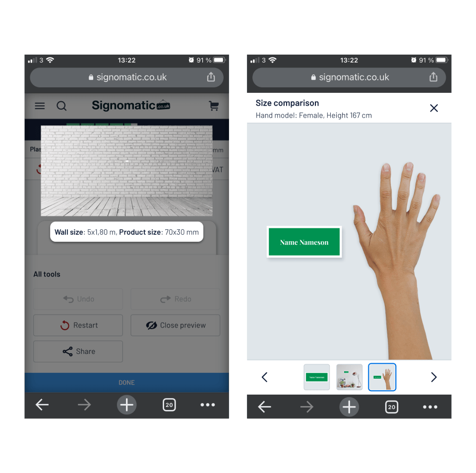
No more misinterpreting the size of the product
The resulting solution
A better product preview means less doubt. Less doubt means a more frictionless e-commerce site.
The final result was a long overdue update to the user interface (UI). No matter what device the user can now preview their signs. By showing the sign in relation with both everyday objects or a human hand it’s cognitively much easier to translate the size you see on the screen to what it actually means in reality.


